SIMULATED LIVE (SIMULIVE) WEBINARS
About GoToWebinar
GoToWebinar is an online webinars software used by marketing, PR and training teams worldwide hosting about 2.7 million webinars every year.
My role
As a UX designer on the Webinar team, I was tasked with a couple of different projects out of which one was overhauling the experience for a recently launched feature (Simulated Live Webinars) to boost usage.

About the project
A vast majority of Webinar presenters present the same the content over and over again. Simulated Live is a GoToWebinar feature that lets Webinar users replace their live webinar presentations with pre-recorded content so Webinar presenters can be more effective and efficient. It lets webinar presenters focus on engaging with the audience rather than presenting the same content over and over again.
The feature although promising was unable to get much traction. I was tasked with identifying the cause of low usage and work with Product, Marketing, and Engineering teams to boost usage of the feature.
After an audit of the user experience, I identified 3 areas of improvement:
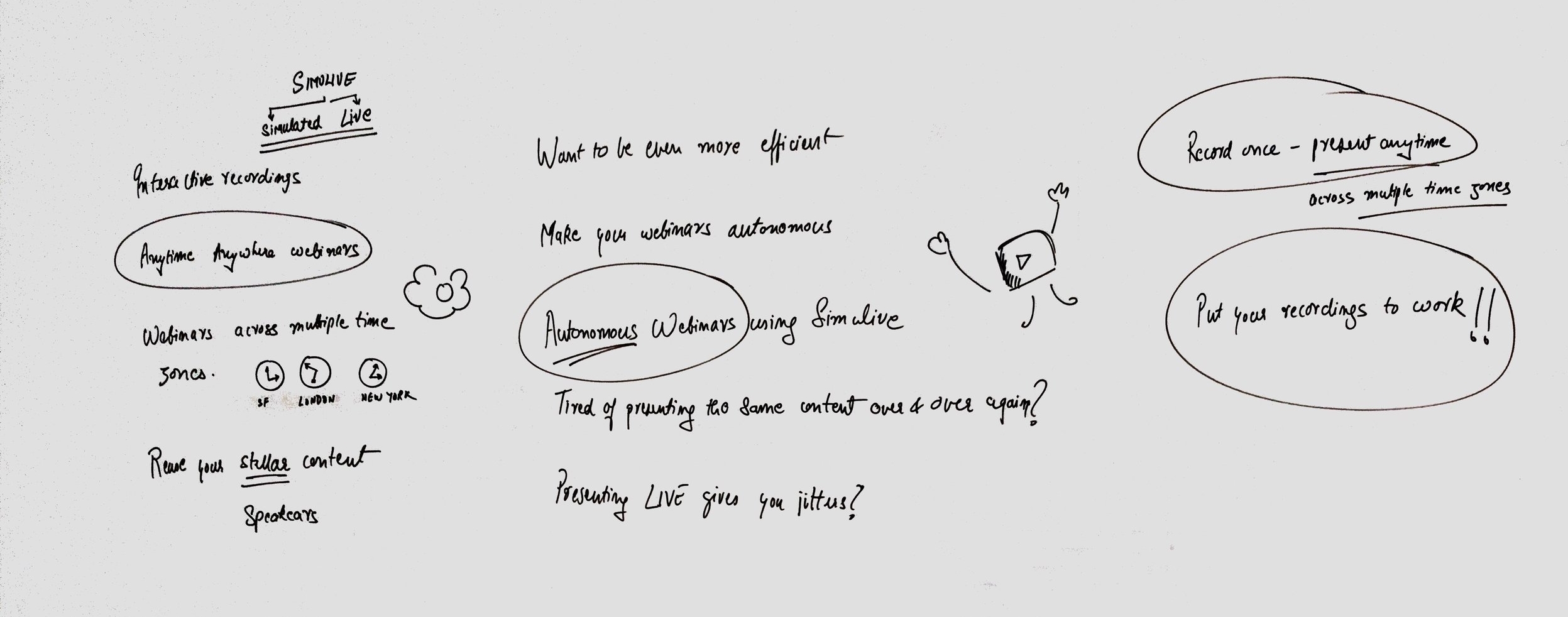
- Create a compelling story (value proposition)
- Make the feature hard to miss (onboarding new and existing users)
- UI flow improvements focusing on an instant hands-on experience of the feature
1. Compelling Story
I worked with the Product Manager and UX Writer to come up with compelling statements to align with pain points & users' priorities w.r.t. webinars - the reason that made us invest in building the feature in the first place.
2. Make the feature hard to miss
One of the hypothesis I had about low feature usage was a gap in feature discovery. Simulated live was presented an option at a stage when a user would have already made up their mind to create a traditional Webinar. Presenting a feature which required a completely different mindset at that stage would result in the user either ignoring it, postponing the discovery or perceiving it as an extra step. I recommended moving the feature discovery to the Webinar landing page and make it hard to miss by leveraging color and placement to aid discovery.

3. UI flow improvements focusing on instant hands on experience
To reduce friction for feature discovery I recommended making updates to the flow by
- Reducing the information required to create a Simulive and moving additional configurations to a subsequent step.
- Providing first time users with a sample video to try the feature (since Simulive required a Webinar recording to begin with).
- Providing first time users with an example of Simulated Live Webinar to experience how it would work for their audience to boost their confidence in the feature.
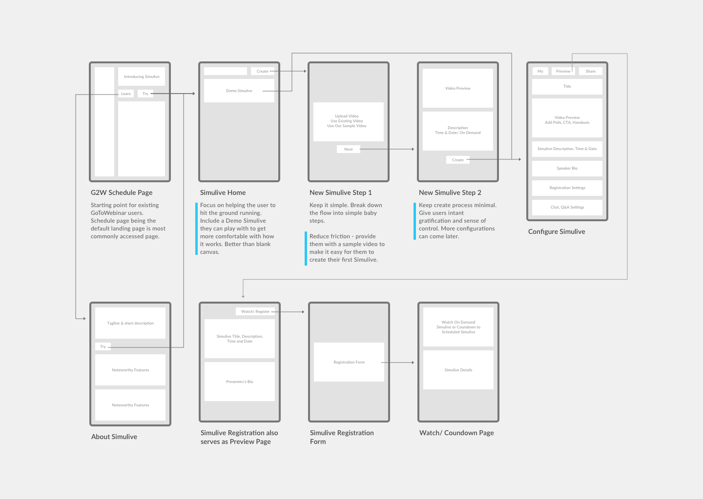
Design and Test
Based on the priorities above, I created a prototype emulating the discovery and creation experience. We tested the designs with using moderated tests with 6 users to make sure the proposed flow and UI aligns with their expectations.


Results
We iterated on the designs based on feedback from the moderated tests. The project was then split into 2 phases. Phase 1 was focused on improving feature discovery and phase 2 for improving the flow.
Within 2 weeks of Phase 1 implementation, Simulated Live webinars saw a 29% jump in usage. Phase 2 is currently under development.